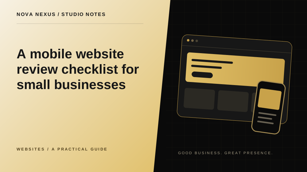
A phone review should follow a real visitor task, not stop at whether the homepage fits on screen.
Start with a real device and a real journey
Open the website on a phone and try to complete a typical visitor task. Find a service, understand what is included and reach the contact page. Use the site as it is, without explaining where things are supposed to be. This reveals friction that a static design screenshot can hide.
Review more than the homepage. Service pages, project details, articles and forms may use different layouts. Check at least one example of every page type. If you have access to different screen sizes, include a smaller phone as well as a larger one. A layout that works on one size may still need refinement elsewhere.
Read the text without adjusting the screen
Look at paragraph size, line length and contrast. You should not need to pinch zoom to read ordinary content. Headings can be large, but they should wrap naturally without pushing important words out of view. Check long service names and buttons, not only the shortest examples.
Watch for horizontal scrolling caused by a wide card, image or unbroken string. A page should not drift sideways while you read. Some intentional galleries scroll horizontally, but that behavior should be clear and contained. The main document needs a stable width.
Review motion and media
Animations should support the content rather than delay access to it. Make sure sections remain visible if a transition fails or the device requests reduced motion. A visual demonstration can be engaging, but the service explanation should still make sense when the animation is paused.
Check video behavior, image crops and loading. Avoid relying on sound to explain an essential point. Important text should not sit where it is covered by a video control or cropped away in a small frame. If an image contains useful information, consider whether that information also needs a readable text equivalent.
Inspect the form before sending anything
Check labels, required fields, error messages and button states. Confirm that the keyboard type suits the input where possible, such as an email field for an email address. A form should explain what information is needed without asking visitors to decipher placeholder text that disappears as soon as they type.
Do not assume a visually complete form has working delivery behind it. Design review and submission testing are separate checks. Use an approved test process with an agreed destination when it is time to verify the connection. Avoid sending real customer data during an ordinary layout review.
Record issues with enough context
For each problem, note the page, device size, action and visible result. A screenshot can help, but describe what you expected as well. “The menu remains over the page after selecting Contact” is more useful than “mobile is broken.” Specific reports make fixes easier to confirm.
After changes, repeat the affected journey and check nearby behavior. A navigation fix can influence scrolling or focus. Keep the final review focused on practical use: can a visitor read, understand, navigate and take the intended next step comfortably? That is the standard the design needs to meet.
Your next creative move
Ready to make this practical?
Explore our website design services, compare the available packages, or tell us what your business needs.
Tell us about your project
Nova Nexus
A creative studio for small businesses. Thoughtful brands, websites and marketing content, made to work beautifully together.
Meet the studio