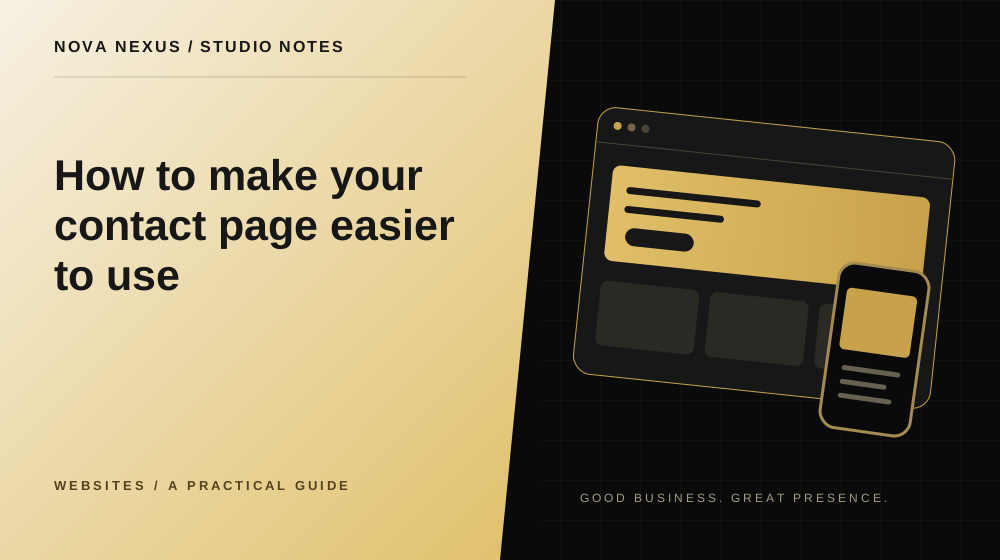
The contact page should make starting a conversation feel clear and manageable.
Tell people what to send
Begin with a short invitation that explains the kind of enquiry the page supports. Ask for the information that helps you respond, such as the service they are interested in and what they would like to improve. Visitors should not need to write a perfect brief before making contact.
Include a simple example of useful context when appropriate. A business owner might mention their current website, intended audience and desired timing. Keep the guidance brief enough that it does not feel like homework. The aim is to reduce uncertainty, not require a complete project plan before the first conversation.
Keep fields tied to a real purpose
For every field, ask what you will do with the answer. Name, email and a project description may be enough for an initial enquiry. A service selector can help route the conversation, but a long questionnaire may be better suited to a later stage. Avoid collecting information because it might be useful someday.
Distinguish required from optional fields and explain any question that could be confusing. If a visitor does not yet know the budget or timeline, give them a sensible way to say so. A form should reflect how real people begin projects, including the uncertainty that often comes with an early idea.
Use labels that remain visible
Labels should identify the field even after someone starts typing. Placeholder text can offer an example, but it should not be the only explanation. Keep error messages close to the relevant field and describe how to fix the problem. A message such as “Enter a valid email address” is more useful than a generic failure.
Check the form with a keyboard and on a phone. Focus should be visible, and the order should feel natural. Make sure the button remains easy to reach after validation messages appear. Small changes in layout can affect the experience when a person is trying to correct an input.
Set expectations carefully
Explain what happens after an enquiry without making a promise you cannot maintain. If you have an approved typical response time, state it as an expectation rather than an absolute guarantee. Tell people whether the next step is an email response, a call or a request for more detail.
Keep the language aligned with the actual workflow. A form that creates an enquiry should not say a project is booked or approved. The success message should confirm only what the system has verified. This helps avoid confusion about commitments, payment or the start of work.
Offer a clear alternative when appropriate
Some visitors prefer a direct email link, while others find a form easier. If you provide both, make their purpose clear and keep the contact details current. Do not display several competing channels without explaining which one is suitable for a project enquiry.
If a booking tool appears on the page, review how it fits the rest of the journey. It should not hide the basic contact information or make visitors feel that a meeting is required for a simple question. A focused contact page can offer choice while still emphasizing one clear next step.
Test the connection separately from the design
A complete visual review checks layout, labels, required fields and error states. A delivery test checks whether the enquiry reaches the intended destination and whether the system reports success accurately. Plan the latter with an approved test address and a clearly identified test message.
Keep a record of what was tested and what remains to be connected. Do not collect real enquiries through an unverified form. Once the workflow is ready, review it after meaningful changes to the site or email provider. A contact page is useful only when both its presentation and its underlying process work together.
Your next creative move
Ready to make this practical?
Explore our website design services, compare the available packages, or tell us what your business needs.
Tell us about your project
Nova Nexus
A creative studio for small businesses. Thoughtful brands, websites and marketing content, made to work beautifully together.
Meet the studio