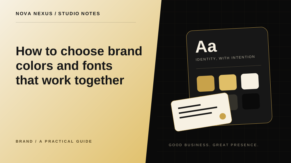
Choose a system that can handle a busy business day, not only a beautiful moodboard.
Start with the impression you need to create
Write three plain words that describe how the business should feel, then connect them to customer expectations. A calm service may need a different rhythm from an energetic event brand. Avoid turning these words into rigid formulas about what a particular color always means. Context, contrast, imagery and language all influence the result.
Collect examples from several kinds of materials, including a website, a social post and a printed piece. Note the specific quality you like in each one. It may be the spacing, strong typography or limited palette rather than the color itself. This makes the reference board a useful conversation instead of a request to imitate another identity.
Give each color a job
Start with a main background, a text color and an accent. Add supporting colors only when they solve a real problem. A small palette can still create variety through scale, spacing and imagery. Using every color in every layout usually makes the design harder to control.
Test the palette in practical pairs: paragraph on background, button label on button, and small text on a card. Check readability using an appropriate contrast checker and review the result at the actual size. A combination that looks attractive in large swatches may not work for a small navigation label.
Choose fonts for different reading jobs
Headings need character and a clear hierarchy. Body copy needs to remain comfortable through several paragraphs. You can use one family with different weights or pair a more distinctive heading font with a quieter body face. The choice should suit the amount and type of content you publish.
Test the actual business name, common service names, numbers and punctuation. Some typefaces look excellent in a short sample but become awkward with long headings or price lists. Compare the options in real layouts before selecting a favorite. Make sure the fonts are available for the uses your business requires.
Build a small hierarchy
Define a large page title, section heading, card heading, body text and small label. These roles should feel related but remain easy to distinguish. Use spacing as part of the hierarchy, rather than relying only on bold weight or color. A clear layout helps visitors understand where one idea ends and another begins.
Keep the number of type styles manageable. When every section introduces a new font size, weight or treatment, the identity can become noisy. A few repeated choices create room for the content. Save those styles in your templates so that each new piece begins with the same foundations.
Test across ordinary situations
Try the system in a long caption, a service card, a flyer and a phone screen. Include a title that wraps onto three lines and a paragraph that is longer than expected. These are normal conditions, not exceptions. Adjust the system until it handles them without squeezing text or shrinking everything.
Look at the design in grayscale too. The structure should still make sense when the accent is absent. This is a useful way to spot layouts that depend on color alone to communicate a difference. Labels, shapes and clear wording can support those distinctions.
Save the decisions where you work
Record color values, font names and example sizes in a short guide. Keep approved templates beside it. If you use a design platform with brand settings, populate them with the same values. A documented choice only helps when the people making content can find it easily.
Review the system after using it for a few real pieces. You may discover that one accent is rarely useful or a heading size needs adjustment. Refine the rules deliberately and update the shared examples. A brand system should be stable enough to recognize and practical enough to use.
Your next creative move
Ready to make this practical?
Explore our brand identity services, compare the available packages, or tell us what your business needs.
Tell us about your project
Nova Nexus
A creative studio for small businesses. Thoughtful brands, websites and marketing content, made to work beautifully together.
Meet the studio